DESIGNER: LEETAO
YEAR: 2022
终端视觉分析
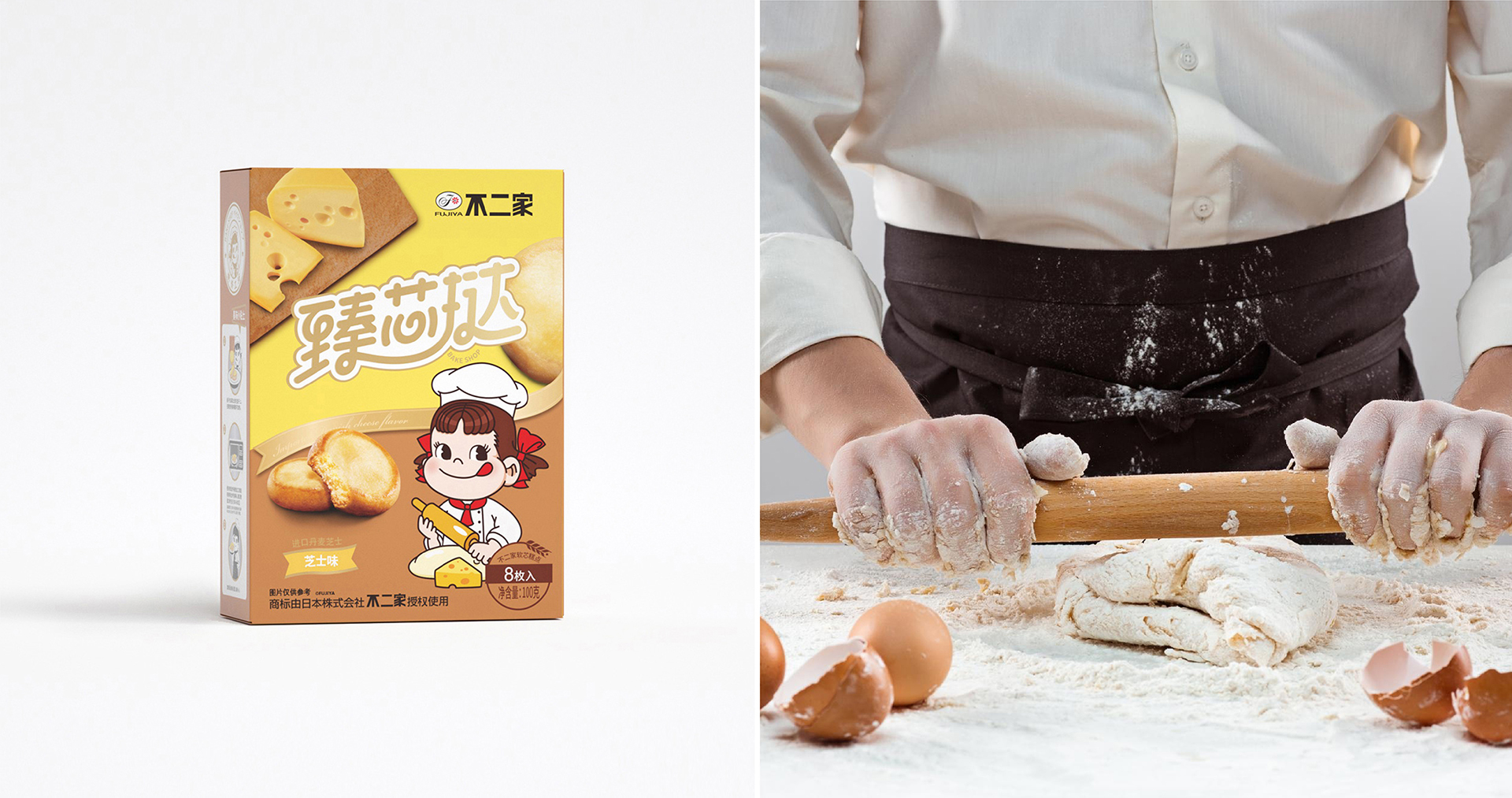
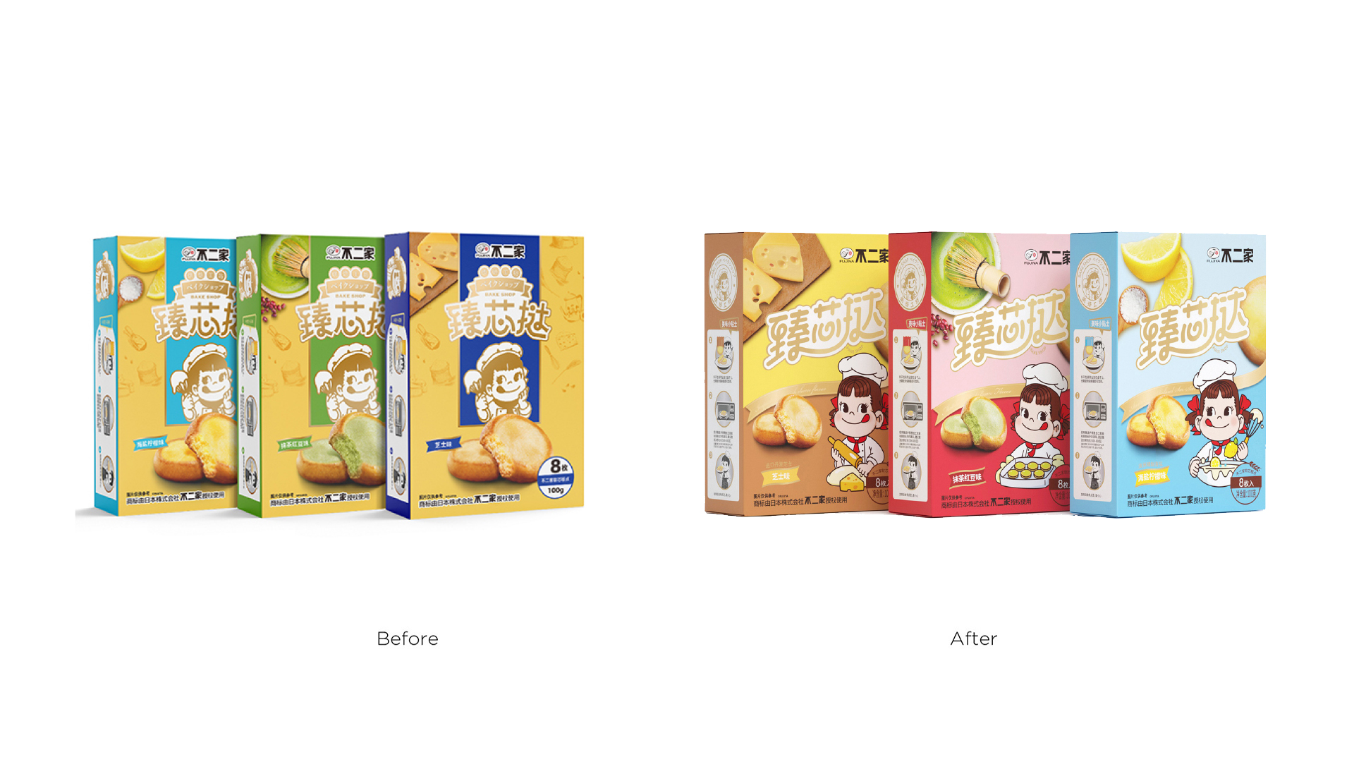
1、包装风格和消费群体不契合,包装品名偏小,在终端陈列不明显,
2、品名臻芯挞和IP peko形象,以及产品视觉上3者都想强调,3者都没有凸显
3、臻芯挞烫金文字和黄色背景颜色一致,视觉上没有拉开
4、画面多个视觉焦点,彼此分开,左上角配料产品图片过大,抢主视觉焦点
5、包装侧面美味小贴士横排,与消费者习惯不符
Terminal visual analysis
1. The packaging style does not match the consumer group, the size of the packaging product name is weak, and it is not prominent in the terminal display. 2. The product name Zhenxin Tart, IP peko image, and product visuals all want to be emphasized, but none of them are highlighted. 3. The hot stamping text of the Zhenxin Tart is the same color as the yellow background, and there is no visual separation. 4. There are multiple visual focuses on the screen, separated from each other. The ingredients and product pictures in the upper left corner are too large and steal the main visual focus. 5. Delicious tips are arranged horizontally on the side of the package, which is inconsistent with consumer habits.
视觉修改建议
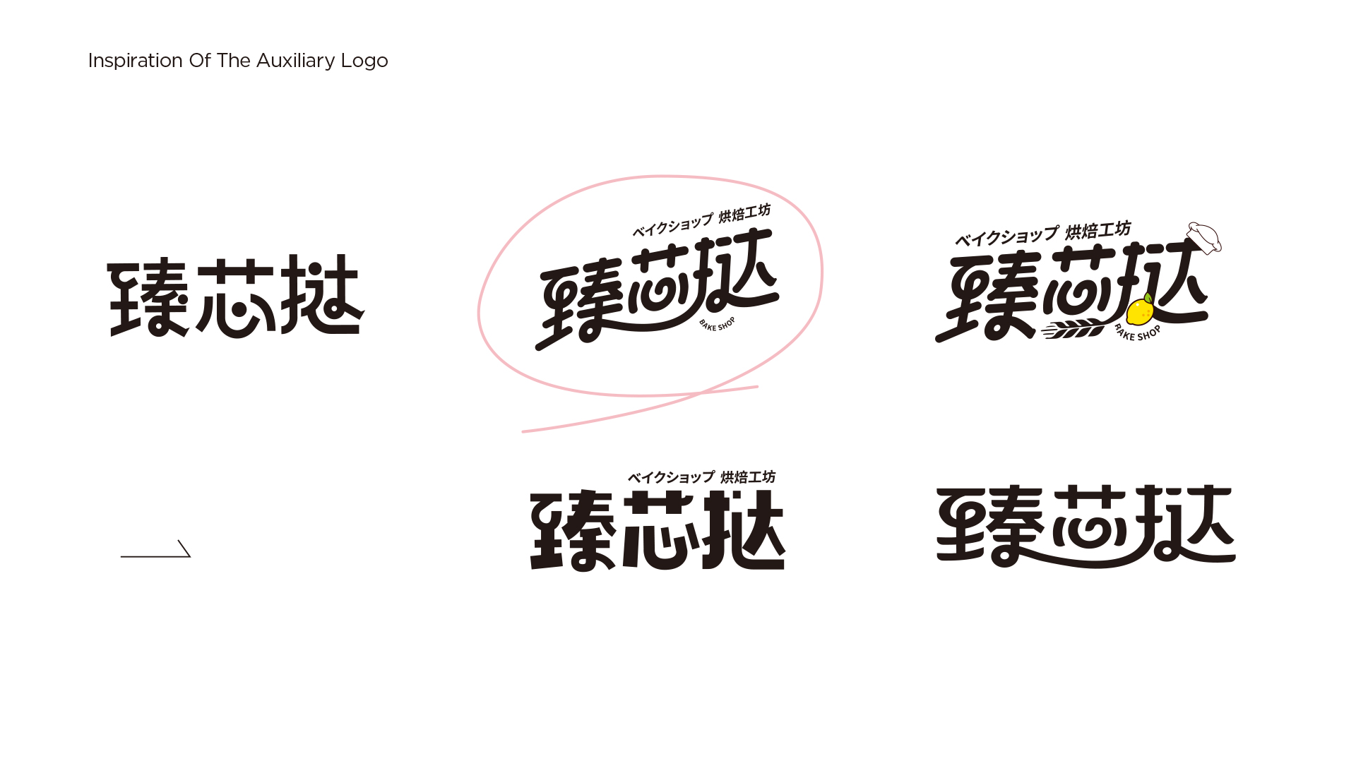
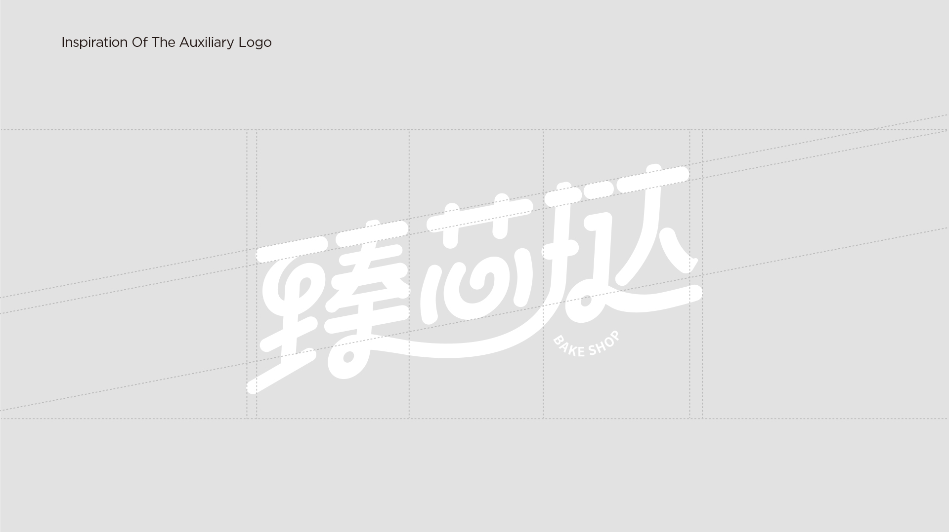
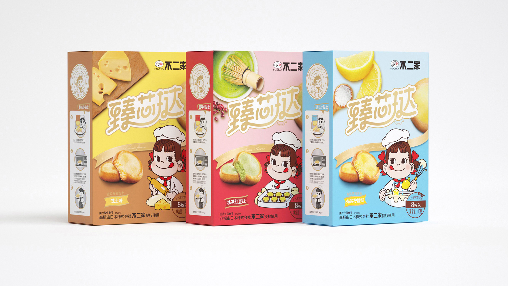
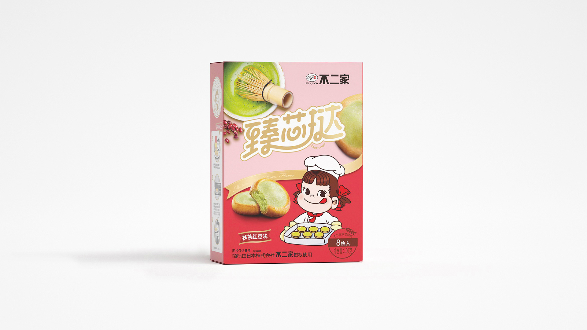
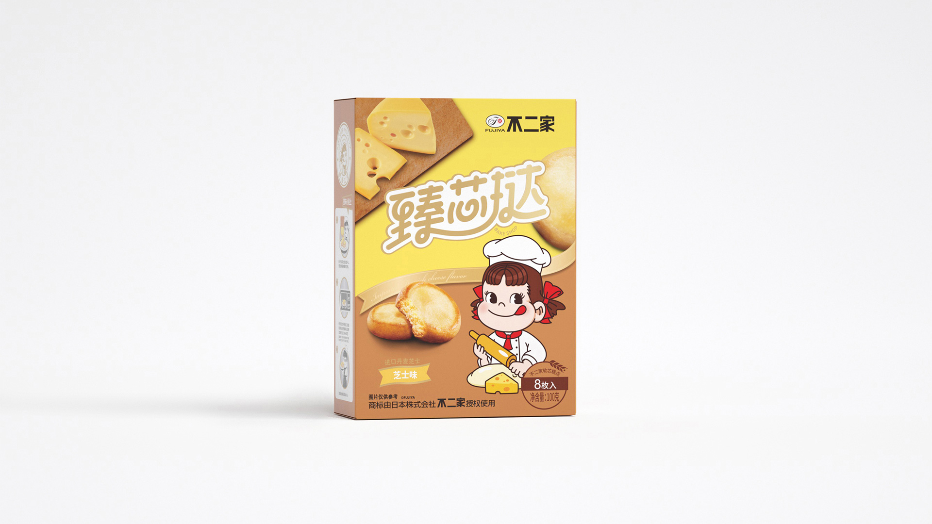
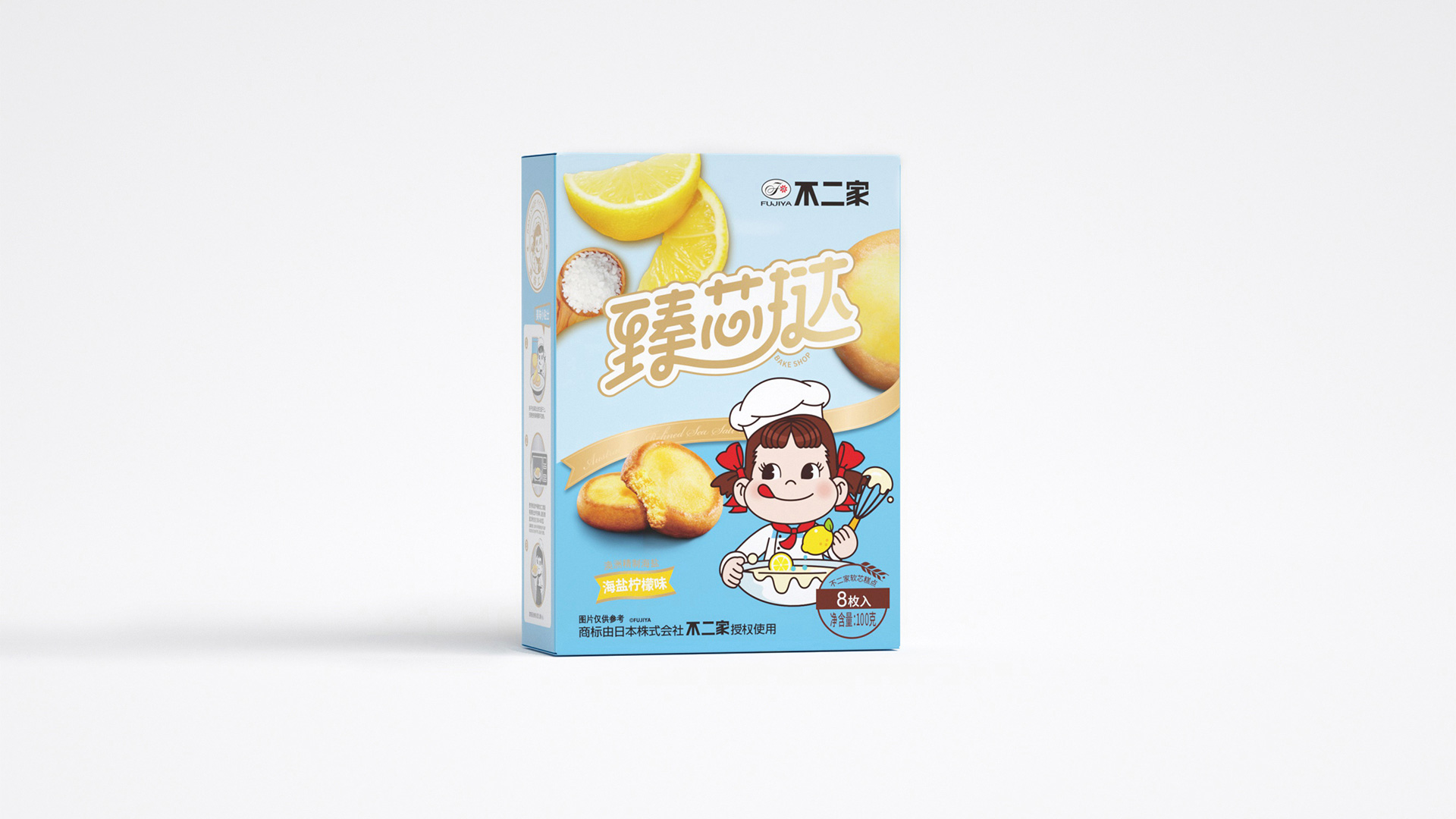
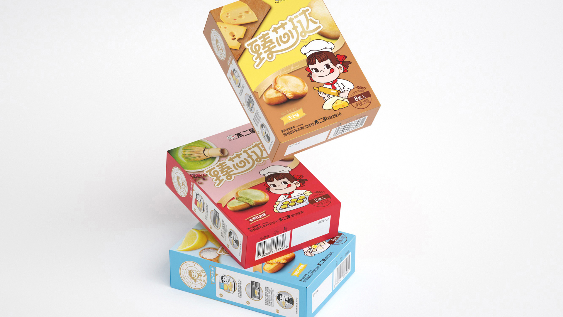
1、品名凸显: 保留日文比划设计的基础上,品名“臻芯挞”放大,建立品类标,突显在终端陈列中。
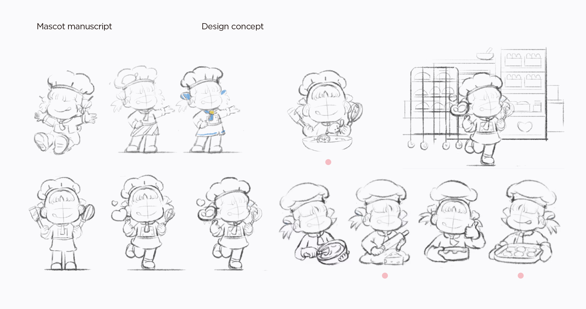
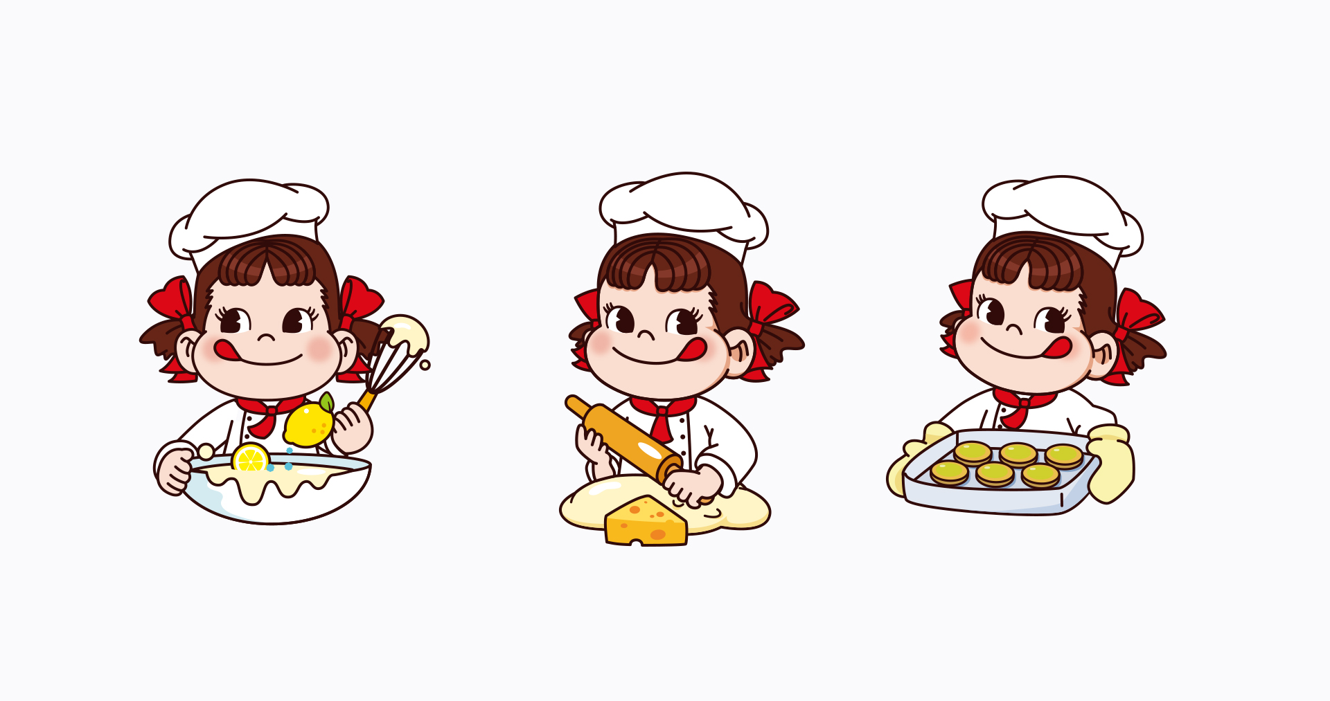
2、IP形象强调: 突出不二家最具识别性的IP形象peko,让消费者迅速识别。
3、包装重新定位: 围绕“烘焙工坊”重新定位包装风格,突出烘焙工坊元素设计。
4、信息梳理: 优化包装信息层级,一级信息包括品类名称、IP形象,二级信息包括产品和口味备注。
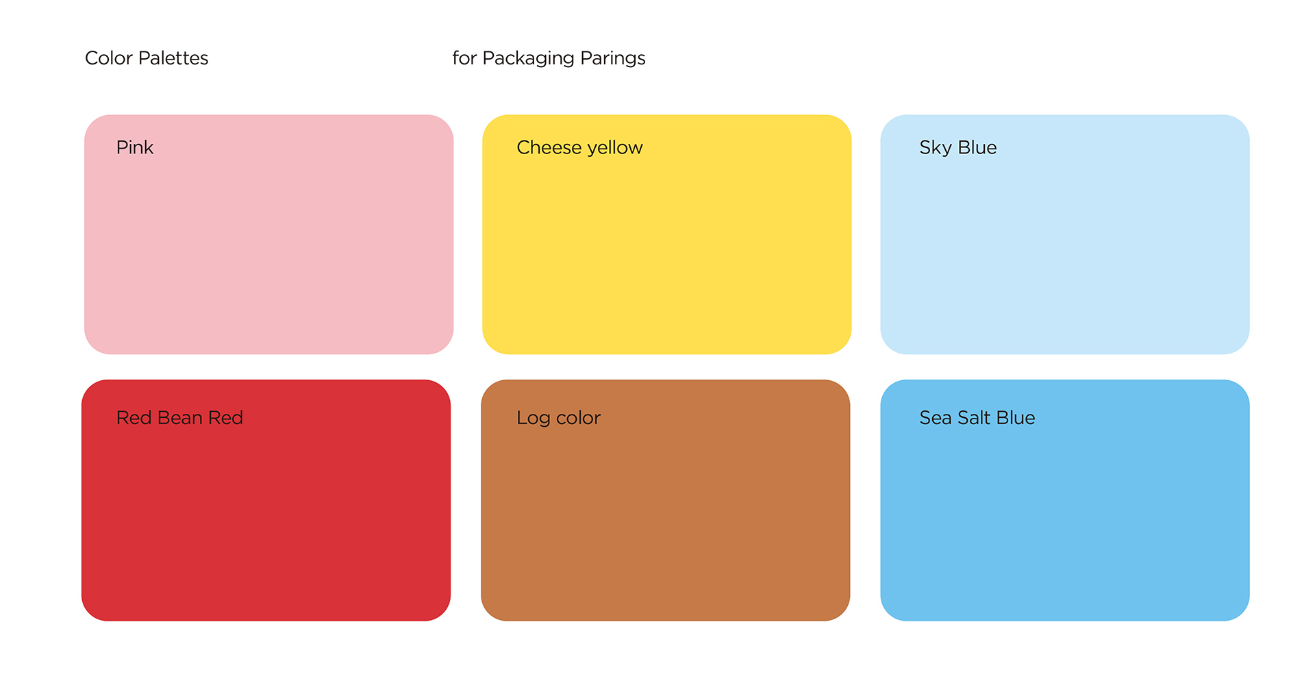
5、颜色调整: 终端绿色不好卖,不要出现大面积绿色,抹茶红豆口味,强调红豆色,提高吸引力。
Visual modification suggestions
1. On the basis of retaining the Japanese graphic design, visually enlarge the name "Zhenxin Tart" to establish a category label 2. Visually strengthen Fujia’s most recognizable IP image, peko, so that consumers can quickly perceive it. 3. The packaging style is repositioned around the "baking workshop" and the element design of the "baking workshop" is extracted. 4. Sort out the packaging information level, first-level information category names, IP images, second-level information products and taste notes, etc. 5. Terminal green is not easy to sell. Do not have large areas of green. Matcha red bean flavor, emphasize red bean color.
COPYRIGHT (©) 2025 李涛.
浙ICP备2023009421号-1
技术支持
![]()
扫描二维码分享到微信