DESIGNER: LEETAO
YEAR: 2019
产品定位:轻滋补品牌
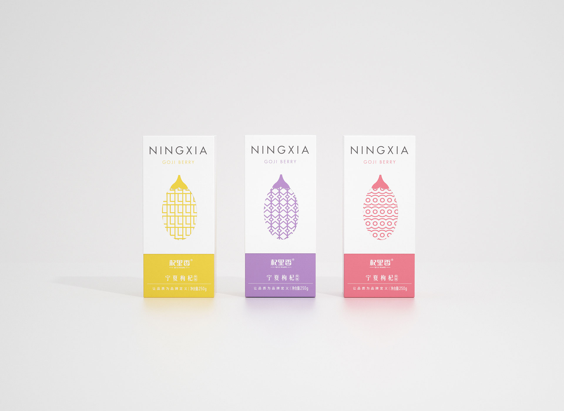
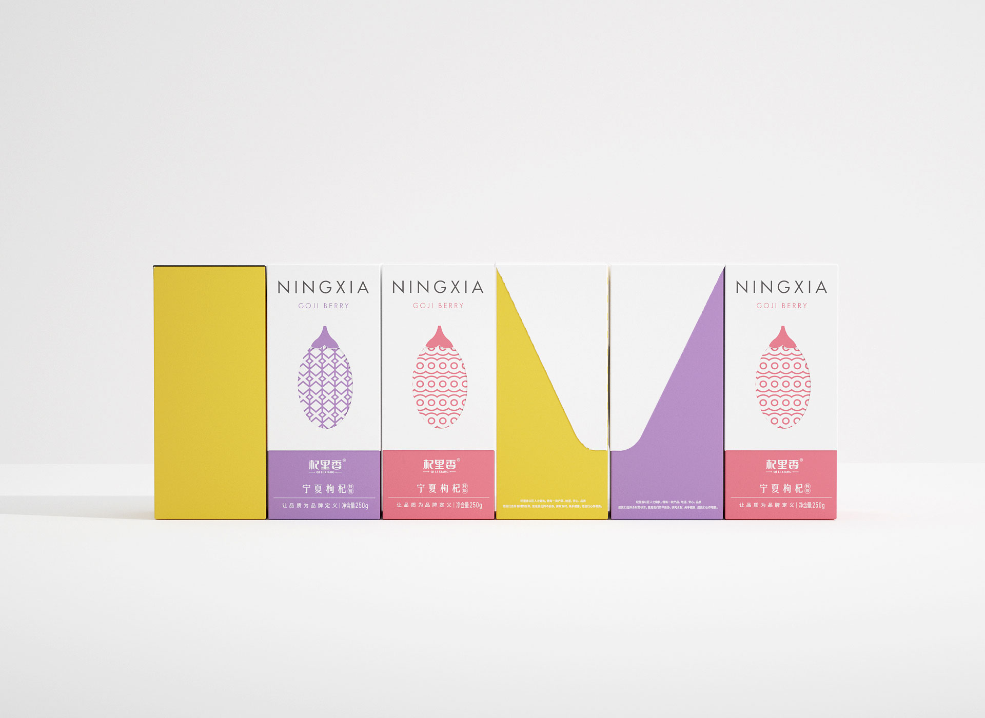
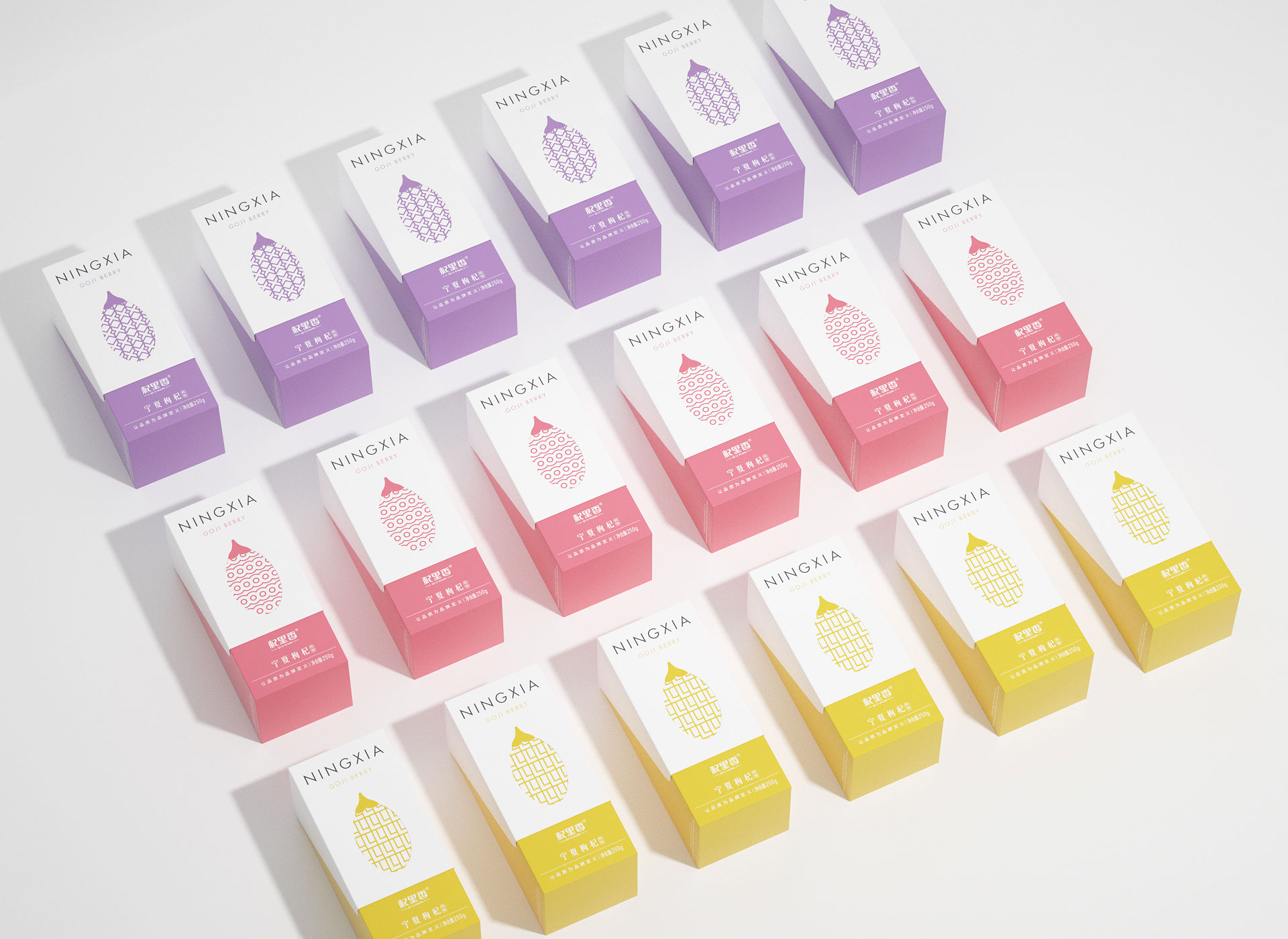
破局符号:红枸杞图标放大作为视觉锤。改变包装盒型,和消费者做有趣互动。
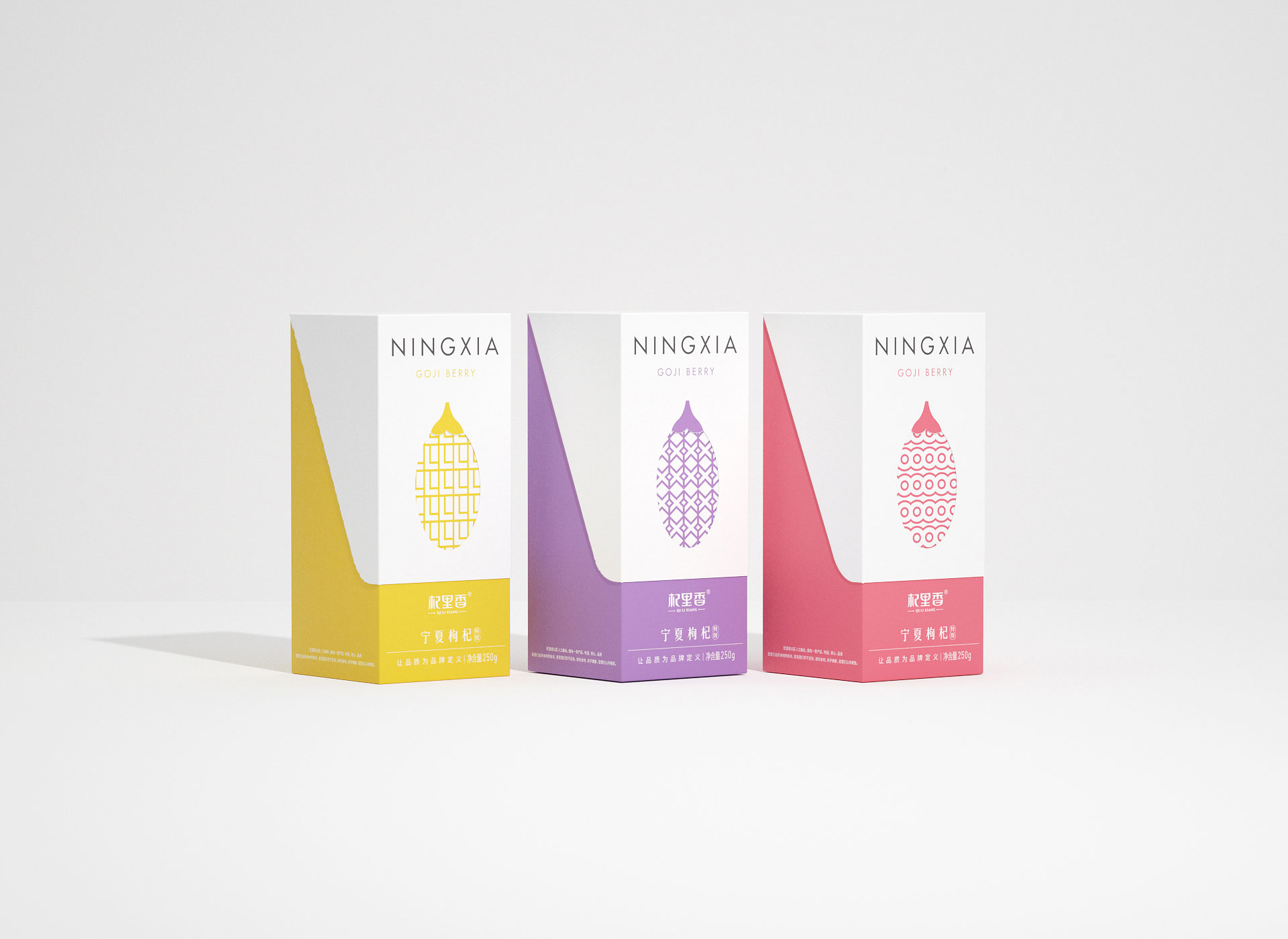
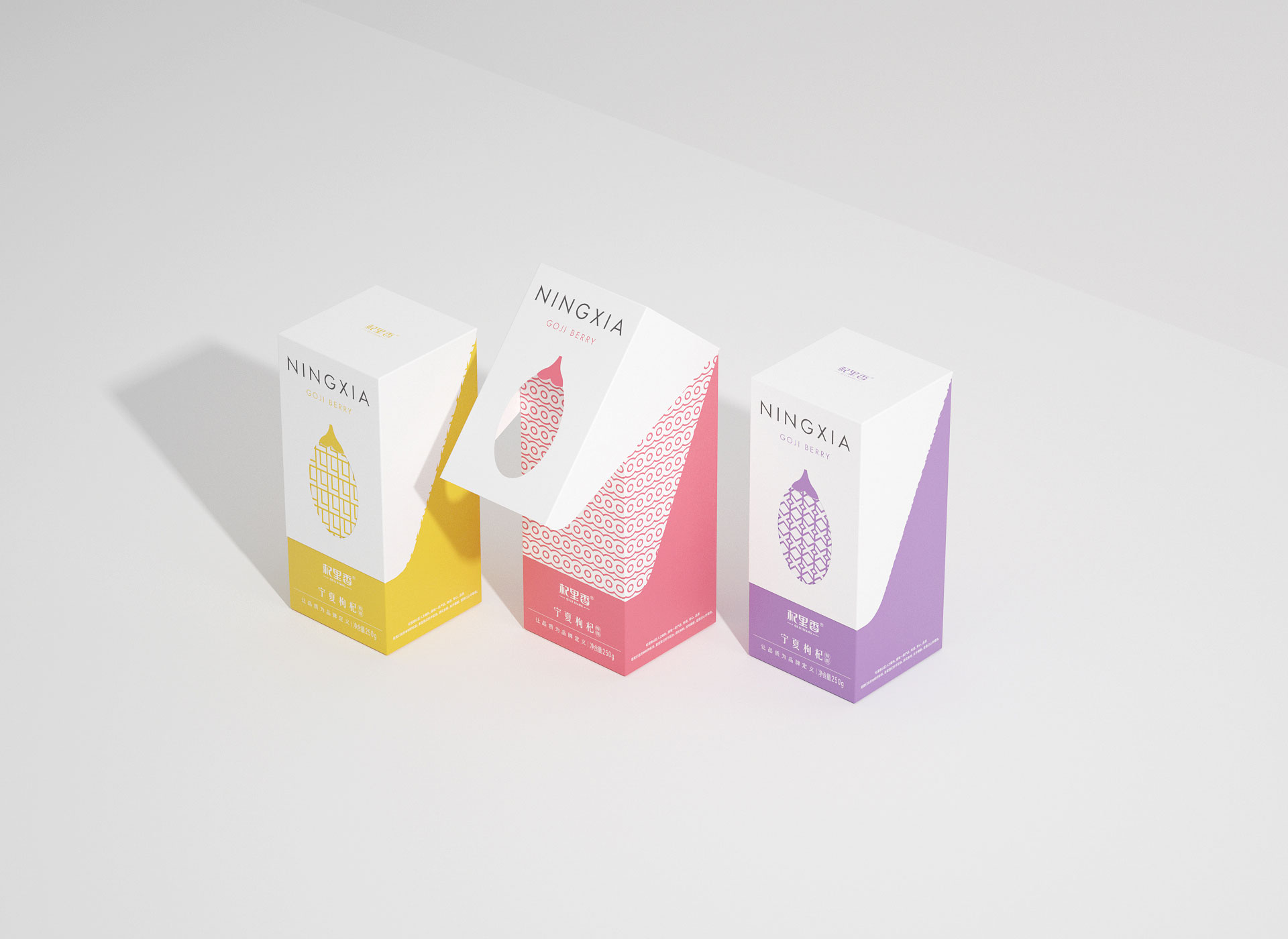
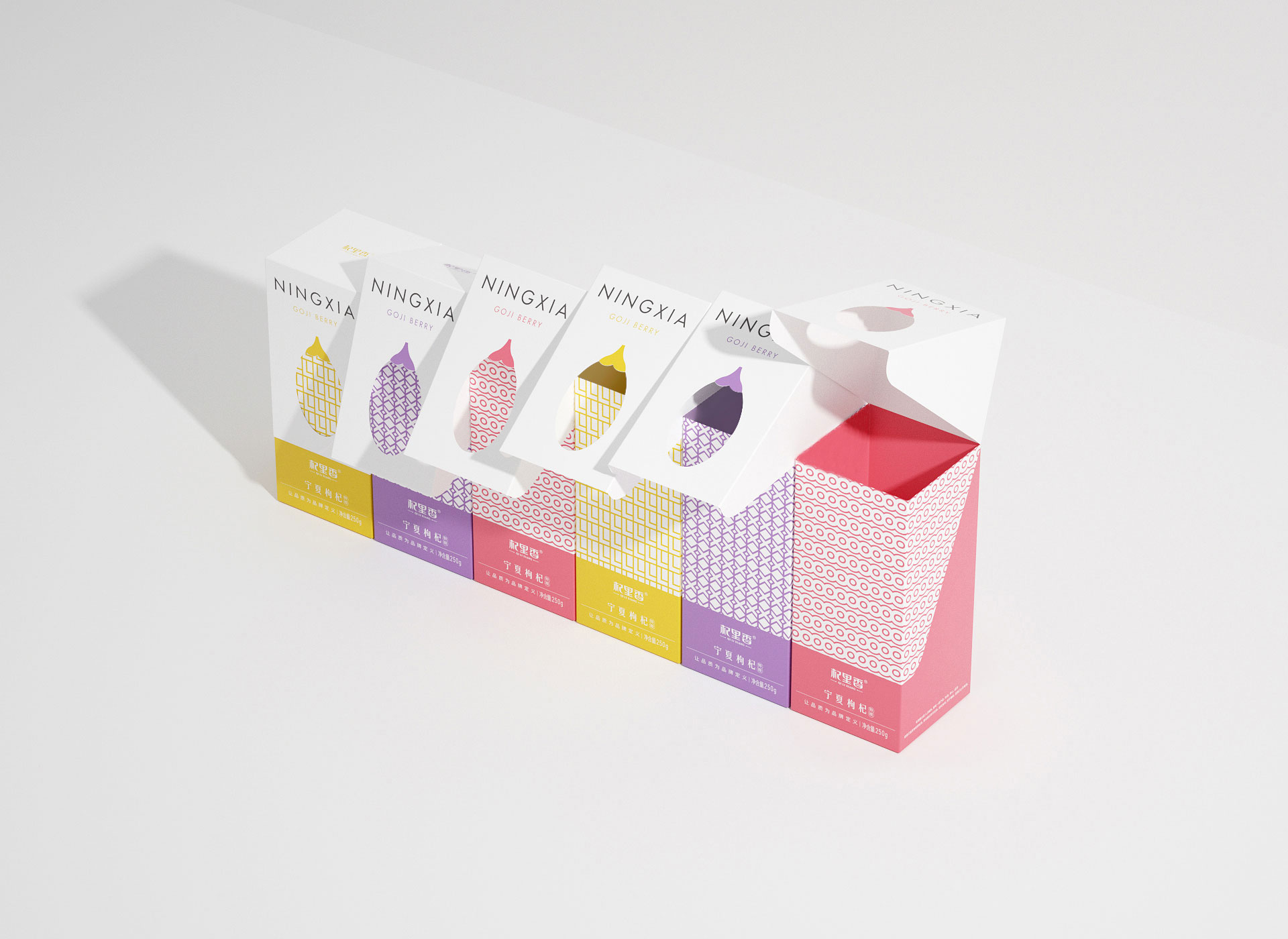
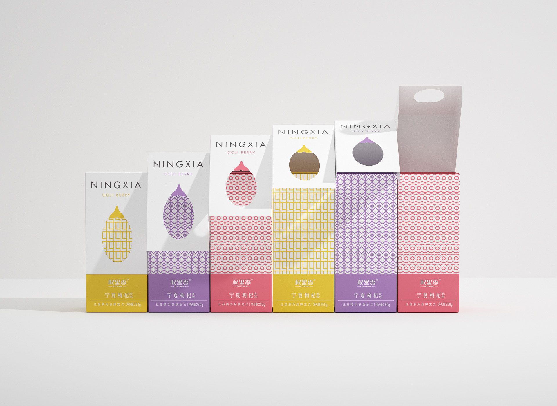
视觉对策:采用人性化的包装翻盖设计,易拿易存,充满仪式感。
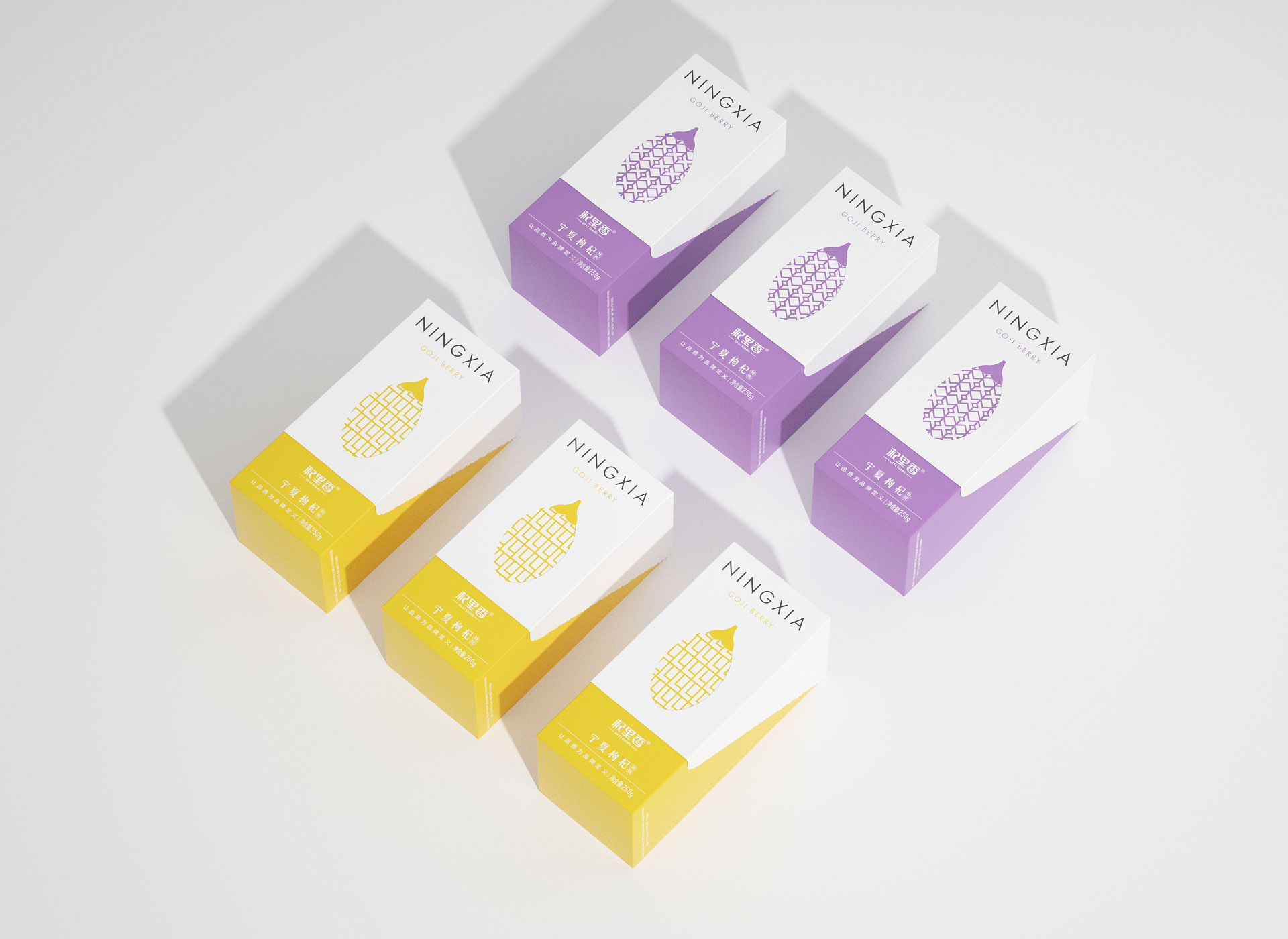
外部翻盖处,放大的红枸杞图案做镂空,加强产品辨识度。
内里处,用杞里香首字母Q,L,X做成不同的图形连续方案,建立消费者品牌记忆度。
Product positioning: light nourishing brand Game-breaking symbol: The red wolfberry icon enlarges as a visual hammer. Change the packaging box type and have interesting interactions with consumers. Visual strategy: Use a user-friendly flip-top packaging design, which is easy to take and store, and full of ritual feeling. On the outer flap, the enlarged red wolfberry pattern is hollowed out to enhance product recognition. On the inside, the initial letters Q, L and
扫描二维码分享到微信