DESIGNER: LEETAO
YEAR: 2019
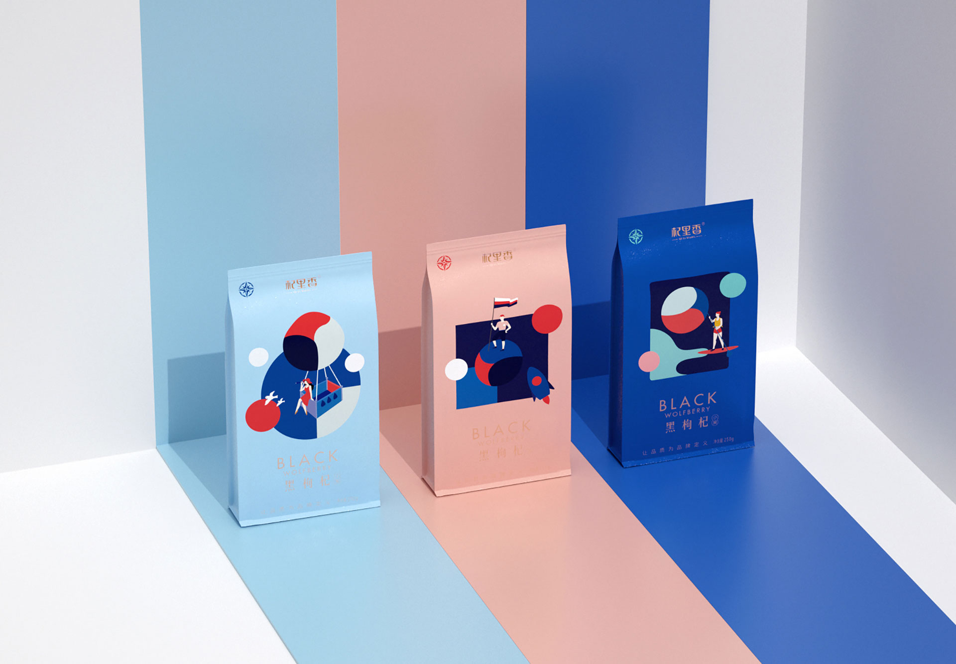
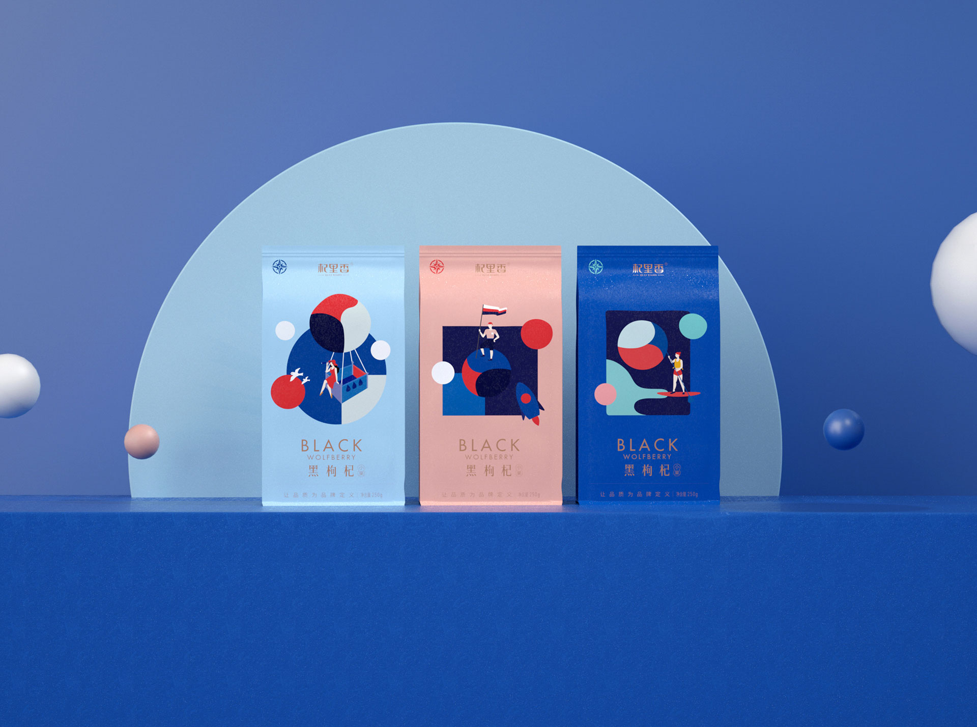
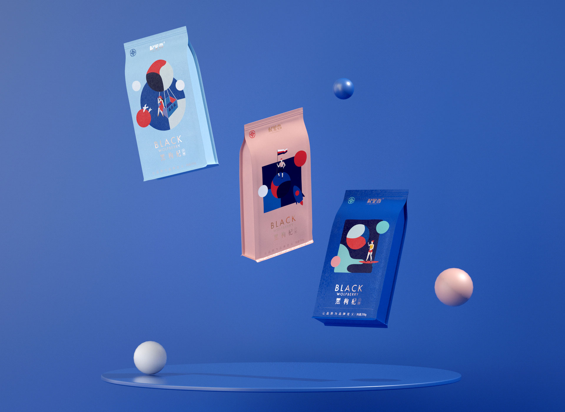
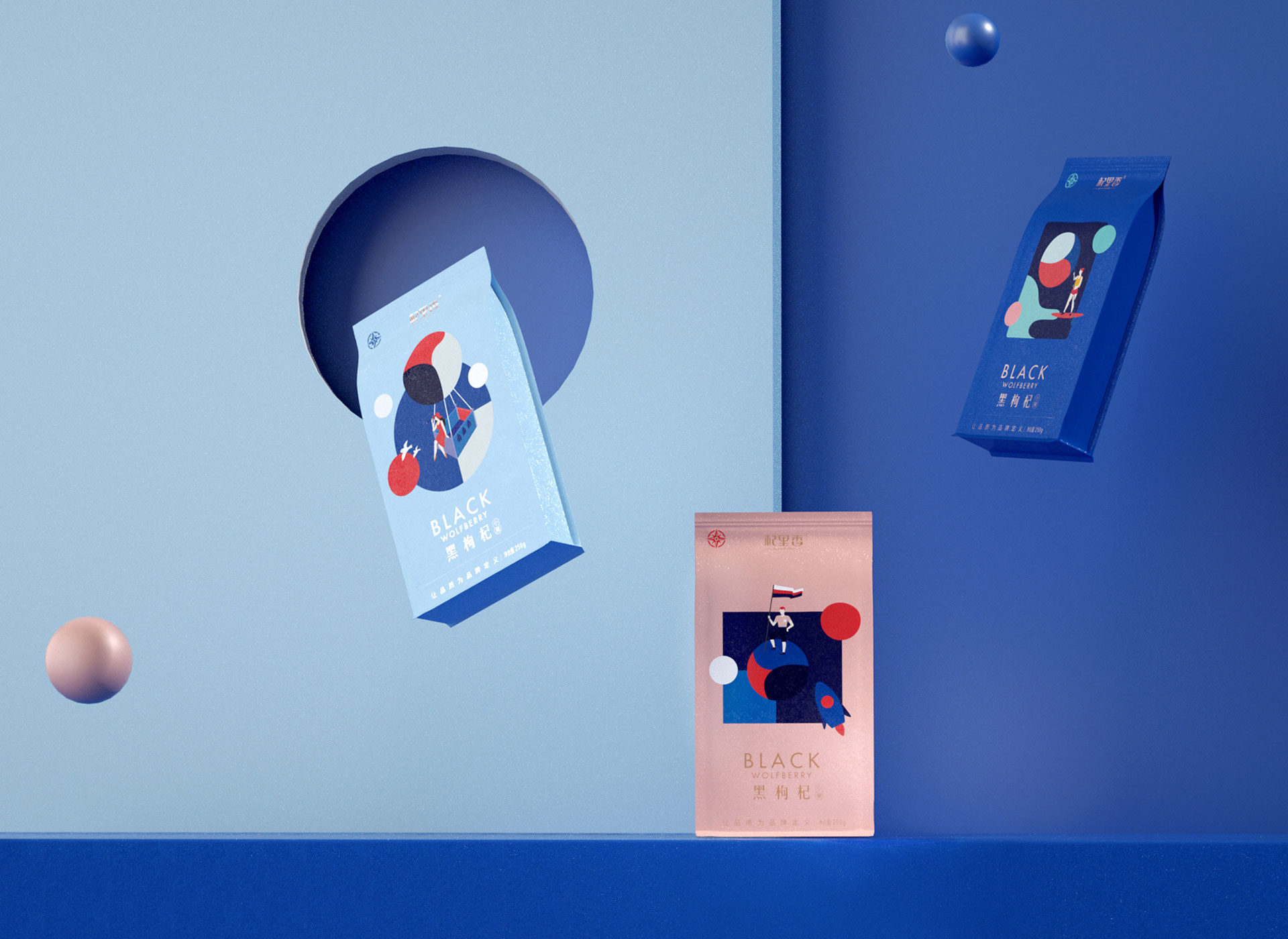
从品质到有趣,从文化到年轻
产品定位:新年轻,新养生,新滋补。
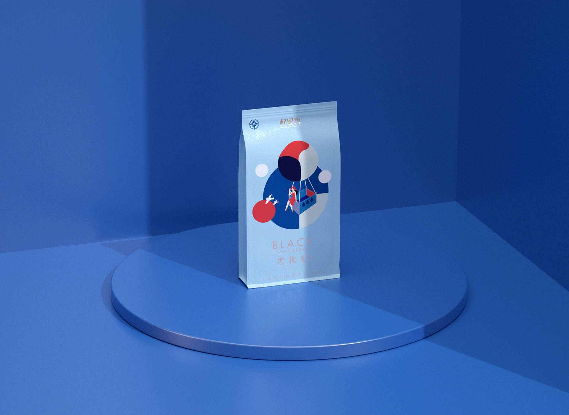
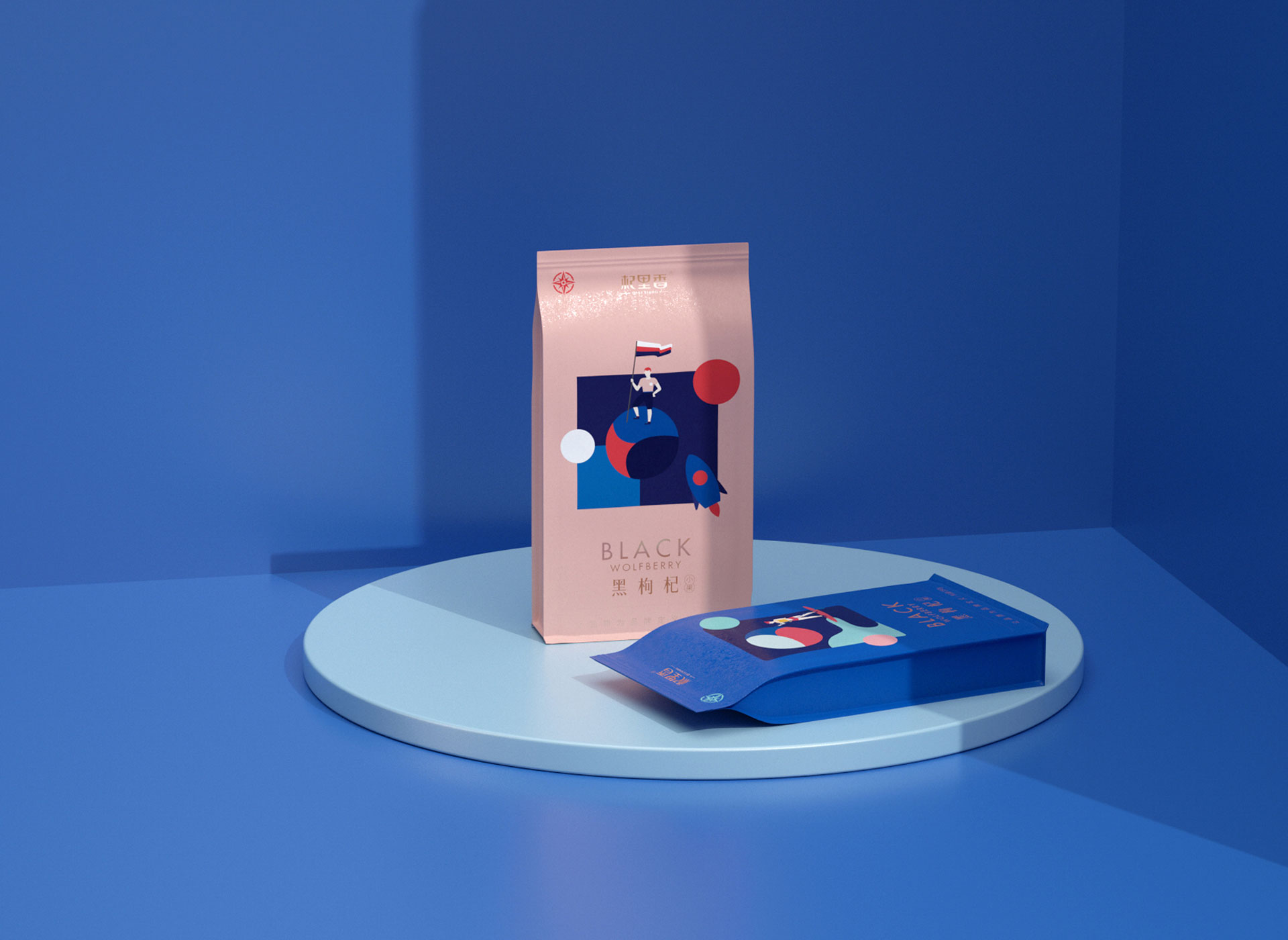
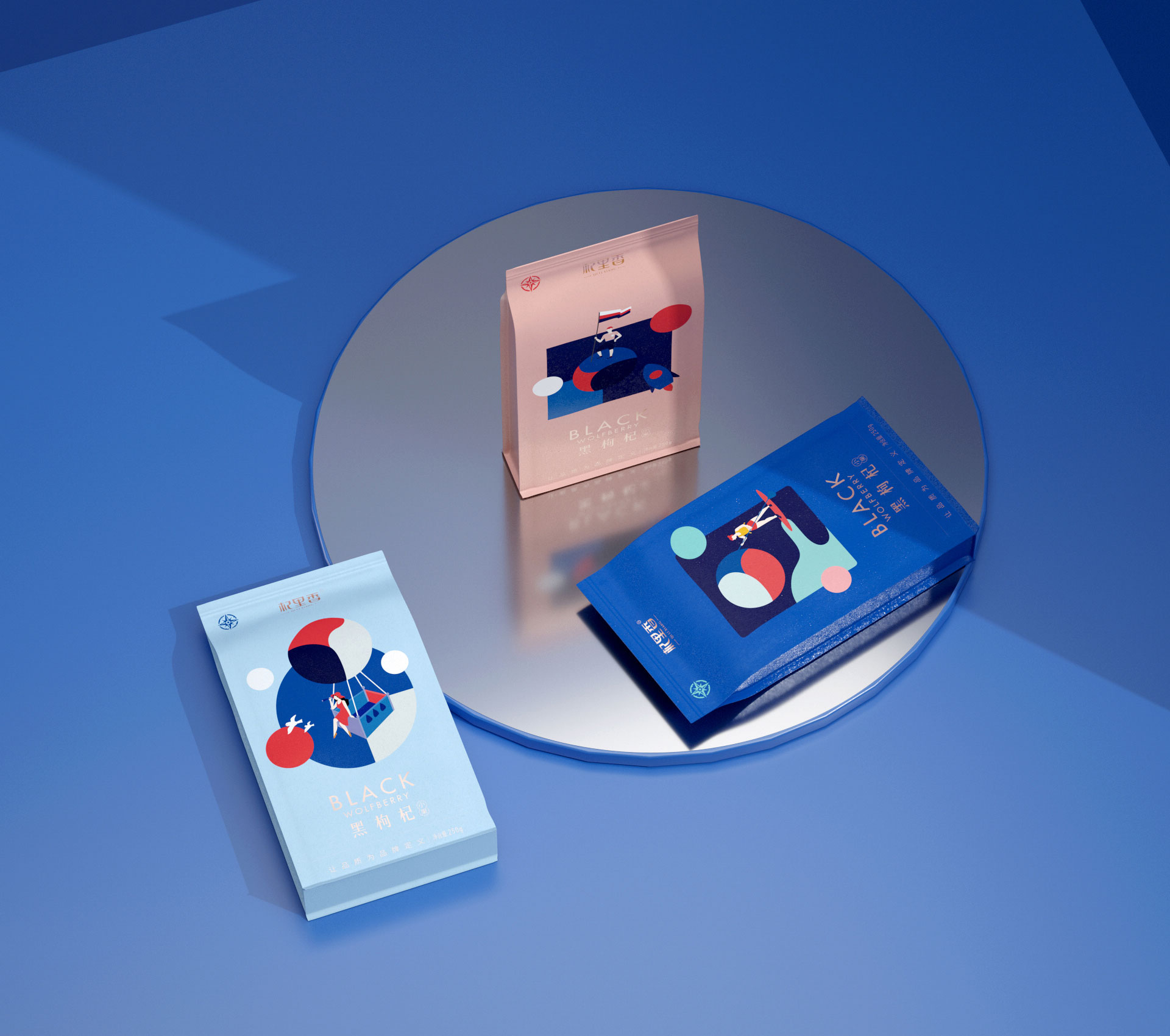
破局符号:寻找黑枸杞大果之旅
视觉对策:结合(热气球)眺望,(划船)寻找,(登月)探索等
三个画面构建一个美味的枸杞世界。
强烈的蓝与红对比配色。
贴合品牌目标:年轻用户群体,同时加强产品系列感,凸显差异化。
From quality to fun, from culture to youth Product positioning: new youth, new health, new nourishment. The game-breaking symbol: a journey to find the big black wolfberry fruit Visual strategies: combine (hot air balloon) observation, (boating) search, (moon landing) exploration, etc. Three pictures build a delicious world of wolfberry. Strong blue and red contrasting color scheme. Fits the brand goal: young user group, while strengthening the sense of product series and highlighting differentiation.
COPYRIGHT (©) 2025 李涛.
浙ICP备2023009421号-1
技术支持
![]()
扫描二维码分享到微信


